BigCommerce offers lots of ways to customize your online store and some of these changes can be done fairly easy. I wrote a while ago about improving your customer's experience and here I'll present you 3 other reasons why they leave your store.
Top reason #1: you do not have guest checkout enabled
Seriously, if I want to create an account the "Create account" link is easy to detect in the upper menu. Why do I need to sign up for an account if I only buy once from you?
Most buyers will come only once to your store so they won't feel compelled to create an account. People already have too many accounts everywhere on the web and might think twice if they want to have a new one.
One particular deceiving way to have customers create an account in store is to enable guest checkout, but automatically create an account with a random password for them. It doesn't matter that you send them the email with the new (automatic and unwanted) account, because they will forget about it the next minute they surf another webpage.
If your customers even return to your site they will be greeted with a nice error when choosing guest checkout: "This email is already in use"! Other customers lost.
You could also read about cart abandonment reasons here. The need to guest checkout is as real as it gets. Let your customers be free and they'll come to you.
Top reason #2: you use multiple page checkout
It is an known fact that single-page checkout performs better than double-page checkout by 21.8%.
There is no real need to multiple pages checkouts, even though the option exists in BigCommerce.
One thing that makes me wonder are BigCommerce store owners that use Google Website Optimizer on the checkout proces to test the single page vs. multiple page checkout process.
Let me spare you the time and hassle: single-page lets customers enter, see and modify data at a glance. As always, once a customer has located the item they need you want to get them as fast as possible to the "Proceed to payment button". Every page refresh can be a stopper. Stick to a single page checkout. It works.
Top reason #3: you do not use clear calls to action
CTA - call to action is a page element (graphic, text, video) that should be different than the rest of the page and that indicates the primary focus of that page. That means that you want it to stick out like a spike that pokes customers in the eye and yells at them WHAT to do or WHERE to go. It does not really yell, but you get the point.
Hubspot has tons of tutorials and "how to's" regarding ecommerce and even CTAs. Make sure sure that you implement one of 11 ideas of CTAs that can help with customer interaction.
Check the image below. With an Add to cart button that stick out by design you get a far better change to show what you need your customers to do:
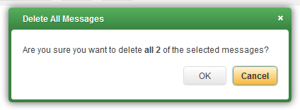
And below is my favorite call to action, from Yahoo. I always click on "Cancel".
Let me know how these pieces of advice helped you and if you'd like me to write about a specific topic you want to learn about.